
A tool, which emanated from the TQM movement, process flow charts are an illustrative and useful technique to allow a person or team to visualise a process.
They are a simple and effective tool and are made even more powerful during a Kaizen activity in a group setting, whereby the team are either designing a new, or ‘walking’ an existing process.
In quality movements, they are a good tool to understand possible escape points; that is identifying the points in the process where easy mistakes can be made or indeed pass through without being detected.
Visualise the Process!
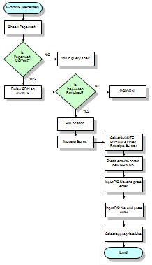
It comes as no surprise then, that process flow charts are invaluable in helping visualise what is going on and also what parts of the process are going wrong, thereby helping the viewer to understand a process, and, if the goal permits, also finding flaws, bottlenecks, and other less-obvious features within each step.
There are many different types of process flowcharts, and each version has its own catalogue of boxes and notations, however, they all provide the same remit:
To visually show the process in order to make improvements.
The two most common types of boxes in a flowchart are:
- A processing step, usually called an activity. – This is displayed as a rectangular box
- A decision, – This is displayed as a diamond.
How to Do it
- Discuss the process with the group and agree the start and end of the process under investigation
- Take a bunch of post it notes
- Walk the process with the team and for every activity, write the task on one post it note
- Continue to walk the process, adding each activity on another post it.
- When completed, map the post-its, in order, on large plotter paper on the wall.
- Review the process with the team and verify the steps have been captured.
- For each step, identify opportunities to make the process better – this could be in the form of quality, cost, lead time, or anything else. – Write these onto the flowchart as you go.
- Once complete, agree actions and owners to improve the process steps identified in step 7.
- Review the actions until all have been closed out.